Reading the deck report
Reading the deck report
Every deck has its own performance report. From any deck row on Decks, click ⋯ → View report. Or from the editor, click the chart-bar icon in the header.
Top stats
Four numbers across the top:
- Total attempts — every play started, complete or not.
- Unique students — distinct students who've played the deck.
- Completion rate — what percent of started attempts reached the end.
- Avg attempt score — average percent correct on completed attempts.

The header also shows the last attempt time. If it says "3 weeks ago" you might want to nudge students.
Activity chart
A 30-day bar chart with a total in the corner. Big totals with flat distribution = active and steady. Spikes with low scores = an assignment hit but didn't go well.
Attempts by section
This is the part that maps results to your actual class structure.
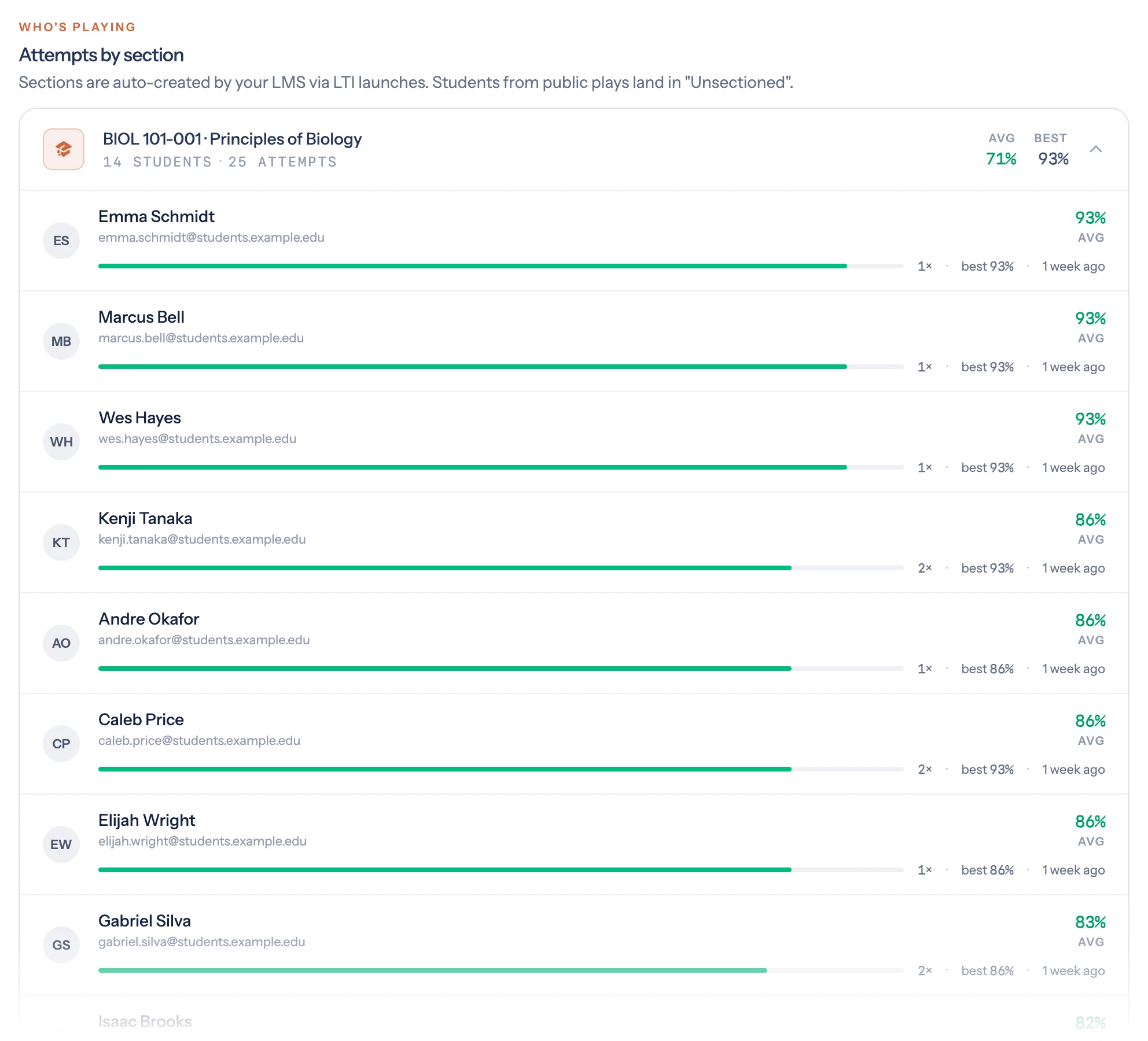
Each LMS section that's been used for this deck appears as a collapsible card:
- Section name with an LTI badge if it came from your LMS
- Student count and attempt count in monospace
- Avg and Best scores on the right, color-coded green/amber/red
Expand a section to see each student:
- Initials avatar + name + email
- A coloured progress bar showing their average
- Three quick stats on the right:
attempts ×,best score,last activity
Any attempt that isn't tied to an LMS section is grouped under Unsectioned at the bottom.
Use the Expand all link at the bottom to open every section when there are several.
Card performance
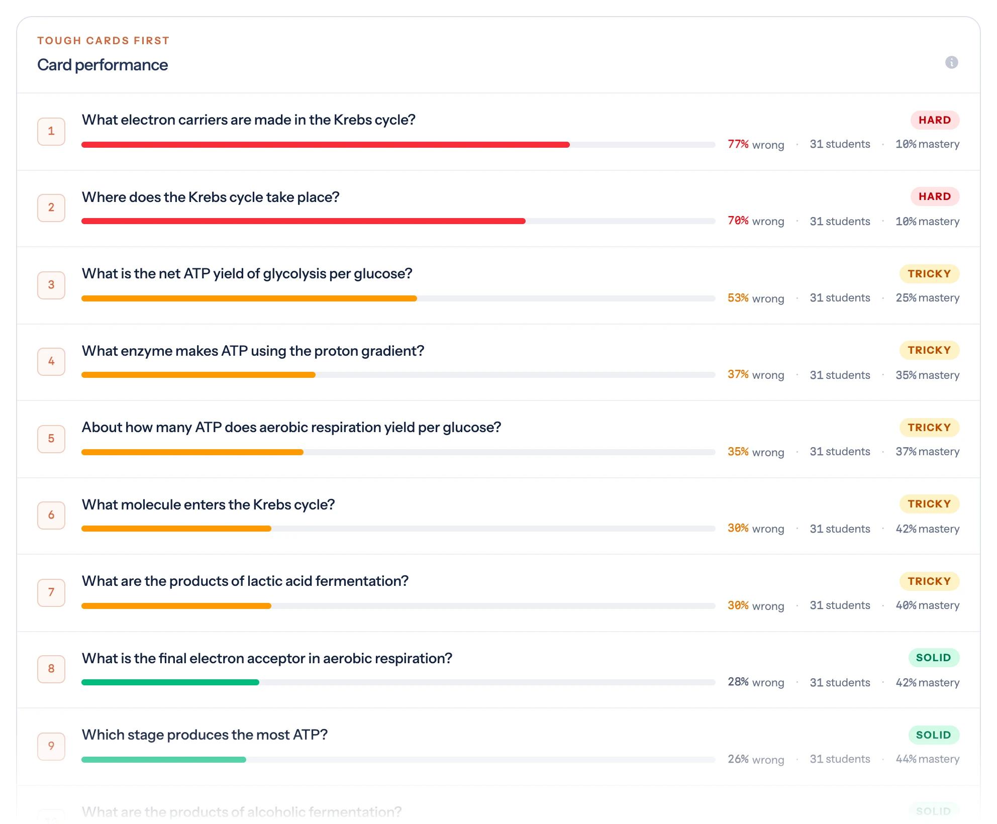
The card table at the bottom is sorted by difficulty — the percent of student responses on each card that were wrong. The hardest cards bubble to the top.
Each row has:
- A coloured difficulty bar
- A status tag: Hard (red, ≥60% wrong), Tricky (amber, 30–59%), Solid (green, <30%), or No data (grey)
- Quick stats:
X% wrong,N students,M% mastery
If a card is consistently in the Hard band, revisit it. Is the prompt ambiguous? Is the answer too narrowly worded? Is the explanation missing context that students need?