A tour of the dashboard
A tour of the dashboard
The dashboard is the first thing you see when you log in. It's a quick read of how your decks are doing this week.
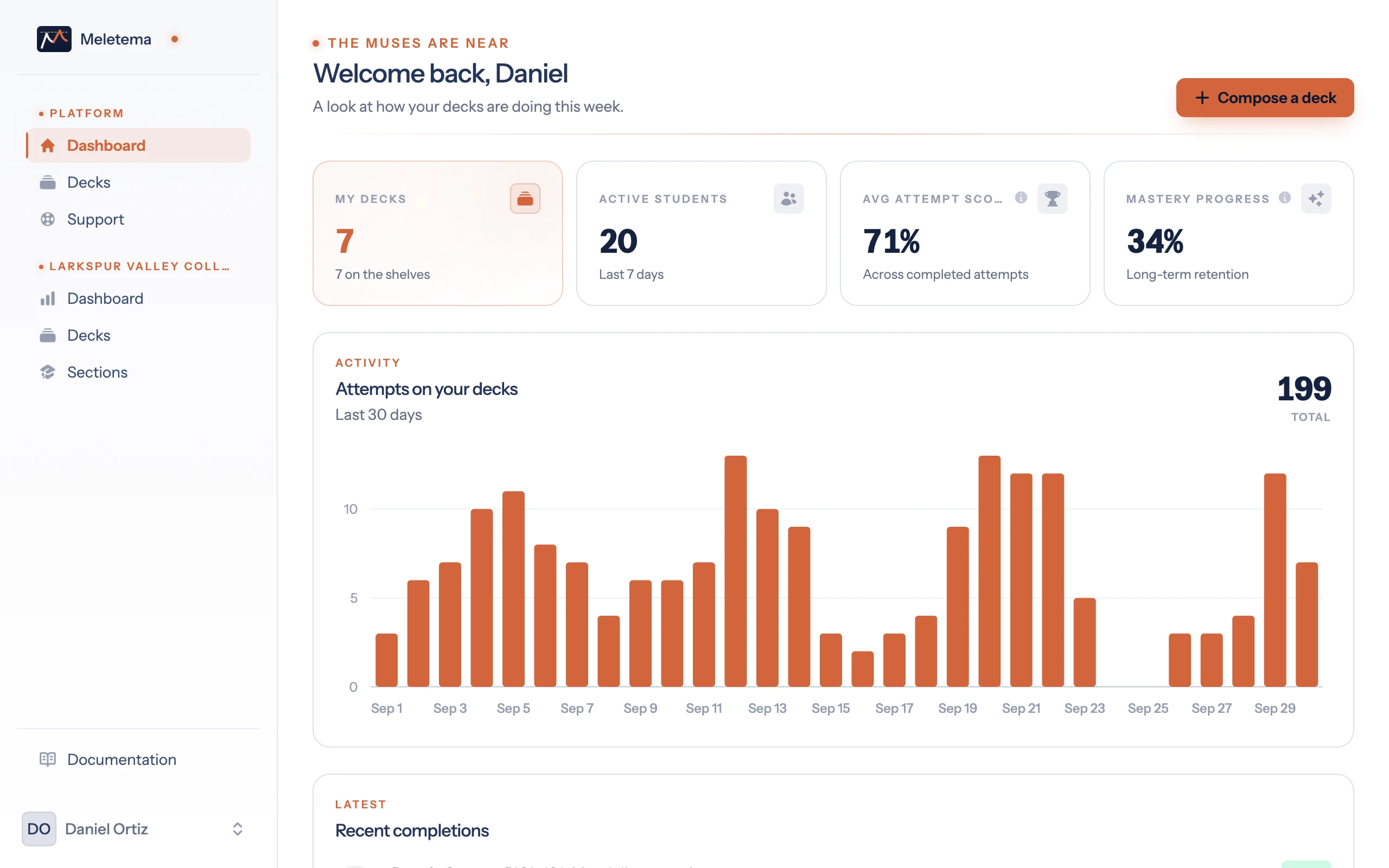
The header
- Welcome line — a personal greeting with a glowing terracotta pip ("the muses are near").
- Compose a deck button — a shortcut to deck creation, anywhere on the page.
Stat cards
Four numbers, scanned top-to-bottom:
- My decks — your total deck inventory.
- Active students — distinct students who attempted any of your decks in the last 7 days.
- Avg attempt score — average percent correct on completed plays. Single perfect run = 100%.
- Mastery progress — long-term spaced-repetition signal. Grows slowly over many correct answers. Don't expect 100% on the first play.
The little ℹ️ icons next to certain labels open a tooltip explaining what the metric actually measures.
Activity chart
A bar-per-day count of attempts on your decks over the last 30 days. The total in the corner gives you a single-number pulse. If it's empty you'll see a "no attempts yet" prompt to share a deck.
Recent completions
The latest five students to finish one of your decks. Click the deck title to jump to the editor — useful if a student tells you a specific card was broken.
Empty state
Brand-new account with no decks? The dashboard switches into onboarding mode and shows the wax tablet and stylus illustration with a "Compose your first deck" button instead of the empty chart.